
5 Steps to a Band Logo You’ll Want To Tattoo on Your Forearm
Band logos are something so commonplace that we usually don't even notice them much. They naturally inhabit the space on posters, music media, social media and merch, and we only start thinking about them when we finally come up with a name for our new band and it's time to give it a visual form. At the latest when preparing the poster for the first gig, but usually much earlier, as the band's online presence mercilessly demands various avatars, headers and cover images. So, today I have some tips for you on how to take on this task and what to avoid.
1. What is a logo actually?
The term "logo" comes from the Greek word logos (word, speech, law, concept) and the most common definition of this term is as follows: it is a visual mark that represents a brand and help it visually differentiate itself from other brands, a good logo also makes the brand easier to remember and further identify by the consumer. But a logo is used in a much broader context than just business. Today, government institutions, theatres, schools, various associations, festivals, and, of course, bands have their logos. However, it is still true that a logo is something that people remember you by.
When a logo consists of only graphic text, usually the name of the brand, then it is called a logotype. Imagine, for example, the Google sign or the Fender sign. A logo can also be an image – a pictogram. Examples are Nike, Apple and the former Twitter logo. Finally, it is possible to combine both, or use both an image and a name or initials.
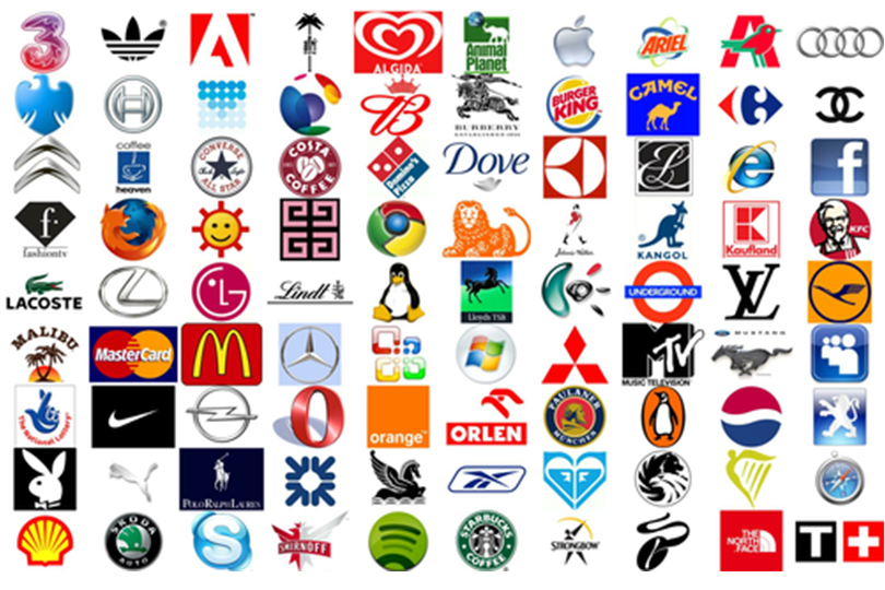
But in any case, the logo should be easy to remember, unique and above all, somehow describe what it stands for. Another essential feature of a logo is that it should work on any scale, from a micro pictogram in the header of a website to a banner on the facade of a department store. To get a better idea, you can look at the following picture or, for example, on your way home from work, count how many times you glimpse a logo somewhere. You will most likely find out that we are surrounded by different logos literally at every turn.
2. Special mission: band logo!
While a band logo doesn't fall into the customer-seller relationship, a band is sort of a brand. You're offering something – namely your music – and hoping that as many people as possible, potential fans, will take notice. The logo is one of the things that makes it easier for fans to identify with your music. Because today (some would say unfortunately) it's not just about the music itself, the visual component of your art is equally important. The question is whether it has ever been otherwise.
Band logos most often fall into the category of logotypes; that is, they contain the name of the band in some graphically interesting way. You can add an image to this if you want or if it makes sense. Rarely does a band present itself with a pictogram alone, because that would mean you suppose that you are already known worldwide and anyone can figure out the name on their own. To know what we're looking for, let's summarize wherever a band logo might appear.
- Posters – for your single gig and gigs of several bands or festivals (if you are among the headliners)
- Band avatar on YouTube, Spotify, Instagram and other profiles
- Merch, from stickers and pins to T-shirts and other merchandise
- Graphics for physical music media
- Stage backdrop
- Billboards when you play at a stadium
- and, of course, the tattoos...
![]()
3. Font, colour and something extra
Summarizing in a few paragraphs how to design a logo is quite a difficult task. For a graphic designer, it is a long process of research, finding inspiration, relations and connections and, of course, many sub-designs. If you have someone like that in your area, and they can design a logo for you for a few beers after a gig, you're all set. If not, and you dare to do it yourself, go for it.
Start by brainstorming together. What's your music, what's key to you? How would you describe yourself as a band? Do you want to move more within a specific genre or do fusion? Do you have any role models? Do you want to be part of a community, or on the contrary, are you unique and go your own way? All this and more can be reflected in your logo.
Then, look at the band name – the most important thing is choosing the right font. The typeface not only communicates the content we read but also carries with it many meanings depending on the type of font. Take a look at the picture below and try to imagine, for each "band", what style of music it plays and how it will look on stage. Just by choosing a font, you're already letting them know if you play more rock or electronic music, if you're more of a badass in tattered jeans or have a perfectly refined style, if you stick to a genre or want to be original. There are plenty of sites on the internet with different fonts available for free download. Take your time finding the right one that somehow catches your eye and matches who you are as a band. Half think it through, and half go with your intuition. You just have to like the font. Then, just remember to check the licenses and terms of use, especially if you plan to run the band as a business; it's worth buying the font for commercial use.
If you have a font, next up is the colour. Do you want to have a band colour? If your band's name is Pink Stripes, for example, I guess you do. But at the same time, it's not necessary at all; a logo can work in just black and white. However, colour is useful – if for nothing else, as a background for the logo in various social media profile pictures. Just as you were looking for a typeface that fits you and your name, think similarly about a colour. Sharp bright colours evoke hard music and edgy riffs, pastel colours lend themselves to dreamy indie pop, sepia tones are likely to make you anticipate a vintage or country genre... Like fonts, every colour carries with it some emotion, history, and relations. Take a look at the visuals of bands of similar genres and how they work with colour, and be inspired.
The last part of a good logo is that mysterious "something extra", which turns a mere band name into an original and memorable brand. It can be a pictogram, an image or a symbol. Or some strangely modified font – for example, the inverted R in the Korn logo. If your band name is made up of multiple words, play around with how they're grouped. Try lots of variations, try to find the strongest concept, and don't be afraid of clear geometric shapes... Brilliant things tend to be simple. Throughout the process of coming up with a logo, keep in mind that it's a graphic symbol of who you are as a band – it has to appeal to you, and it has to resonate with you in some way. If you wouldn't want to tattoo it on your forearm (or at least print it on a T-shirt) yourself, you cannot expect your fans to be willing to do the same.
![]()
4. What to avoid
When designing or thinking about your new band logo, it's a good idea not to make unnecessary mistakes. Here are some tips:
- Avoid taking the too easy solutions: "...so get an AI to design your logo," your IT enthusiast friend may well advise you. Or you can type "band logo design" into Google and you'll discover lots of pre-made patterns, many "professional" logo generators and other tempting tools. Try to resist them. Approach logo design at least as seriously as you do choosing a band name. Your logo should be as unique as your music and should somehow express what you are as a band.
- The journey can be complicated, but the result should be simple. Perhaps the most unusual mistake in logo design is being too complex and descriptive. Always keep in mind that the logo needs to work on a variety of scales and be understandable at a glance. The simpler, clearer concept you can come up with, the better. Try to avoid depicting specific things and musical instruments, various thousand times used symbols and clichés, and unnecessary "curls". If you already want to use a thing or an animal, look for a way to convert it into a simple symbol. Just like a well-arranged song, a good logo has just enough of everything.
- Changing your logo is like changing your name – if your logo is going to work well, you need to make sure you don't change it every few months. It takes time for fans to get familiarized with it. When companies change their logo, it's always a big deal and needs to be communicated well. But at the same time, a logo isn't a forever thing, and if you stop liking it after a while, it's time for a change. The perfect time for a new graphic design, for example, is a new album. The logo will be part of the album visuals, and then it can stay with you.
![]()
![]()
5. What to do with the logo when we finally have one
If you get a logo designed by a professional graphic designer, quite often, you will get something called a graphic manual with it. It usually describes precisely how you can use the logo in the different contexts we mentioned in point 1. If the logo is to work properly, you can't do anything with it. I'll mention a few general principles.
The first and perhaps most important point is the aspect ratio. The logo has to work in different scales, from a thumbnail to a billboard, for example. But you must always keep the same aspect ratio. So zoom in diagonally. It is unacceptable to make the logo just a little bit narrower because it might not fit on your badge. This is because every logo is carefully designed, and its proportions are important. Changing the size in just one direction will distort this carefully tuned proportion, just as you would distort someone's face if you zoomed the photo only in width or height.
The second common adjustment is colour changes. Even these shouldn't be completely random, especially if the logo contains some colour in its basic form. The most common variations that I recommend you prepare are dark (light graphics on a dark background), light (the opposite), and black and white (possibly also in two inverse versions). This should basically do. If, for some reason, you need additional colour variations, then work with, for example, black graphics on a different coloured background. Avoid many colour variations of the logo; you will then unnecessarily confuse your fans as to which is actually the right one.
Especially if you have a long band name, you'll also need a minimalist version of the logo for avatars on YouTube or Spotify, for example. Here you usually have to fit it in a circle about 1 cm in diameter. The first letter or letters of the band name work well, and if you have an image or brand in your logo, now is the time to use it.
![]()
Do you have a band logo? And which band would you have tattooed? Let us know in the comments!
If you have found an error or typo in the article, please let us know by e-mail info@insounder.org.
